
Controls
Controls are the views people interact with. Each one either runs an action (a button) or edits a value through a binding (a text field, toggle or picker).
enum Size { small, medium, large }
app Order(width: 300, height: 200) {    state name = ""    state giftWrap = true    state size = Size.medium    state placed = false
    VStack(spacing: 12, alignment: .leading) {        TextField("Your name", text: name)        Toggle("Gift wrap", isOn: giftWrap)        Picker(selection: size) {            Text("Small").tag(.small)            Text("Medium").tag(.medium)            Text("Large").tag(.large)        }        Button("Place order") { placed = true }            .disabled(name == "")    }    .padding(16)}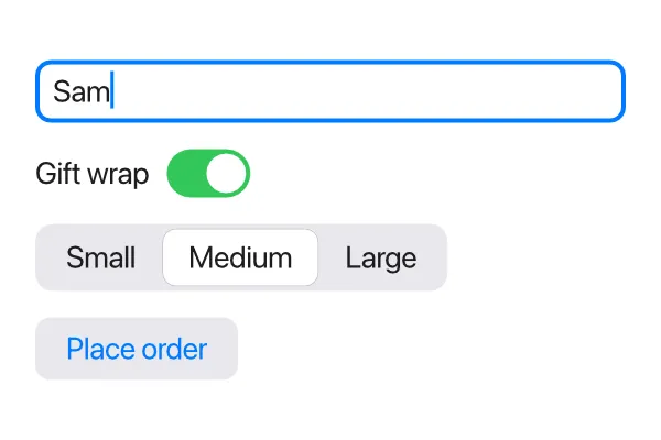
Button
Section titled “Button”Button shows a label and runs its block when clicked:
Button("Save") { save() }The block is the button’s action: parameter, written as a trailing block.
Writing it with its label, Button("Save", action: { save() }), means the
same thing. When the action is just a call to a function with no parameters,
you can also pass the function itself: Button("Save", action: save).
The label is a String. Buttons have a light gray, rounded look with a blue
label; .color(…) changes the label color and .background(…) replaces the
gray. For something that doesn’t look like a button at all, use .onTap
(below).
A disabled button (.disabled(true)) is faded and ignores clicks.
TextField
Section titled “TextField”TextField is a one-line text input. Its first argument is the placeholder,
shown in gray while the field is empty, and text: is bound to the String
it edits:
TextField("Search", text: query)Every key press changes the bound string right away, so anything that uses it updates as the user types.
A text field is as wide as it’s allowed to be: in a stack it stretches across
the available width. Give it a .frame(width:) to make it a fixed size.
Click a field to start editing it; a blue ring shows which field is being edited. Clicking somewhere else, or pressing Escape, stops editing.
Submitting with Enter
Section titled “Submitting with Enter”.onSubmit { … } runs a block when the user presses Enter in the field.
Pressing Enter also stops editing the field.
app Chat(width: 360, height: 240) {    state draft = ""    state messages: [String] = []
    TextField("Message", text: draft)        .autofocus()        .onSubmit { send() }    for m in messages {        Text(m)    }
    fn send() {        if draft != "" {            messages.append(draft)            draft = ""        }    }}
Starting with the cursor in a field
Section titled “Starting with the cursor in a field”.autofocus() starts editing a text field as soon as it appears, so the user
can type right away without clicking it first. It also works on a
CodeEditor. It applies when the field appears: at
startup, or when an if starts showing it. That makes it a good fit for a
field that pops up when needed, like a “New file name” prompt.
Toggle
Section titled “Toggle”Toggle is an on/off switch bound to a Bool:
Toggle("Dark background", isOn: darkBackground)Toggle(isOn: todo.done)The label is optional. Clicking the switch or its label flips the value.
Picker
Section titled “Picker”Picker lets the user choose one of a few options. It’s drawn as a row of
segments, with the selected one highlighted. selection: is bound to the
chosen value, and each option is a view marked with .tag(value):
enum Filter { all, active, done }
app Todos(width: 360, height: 200) {    state filter = Filter.all
    Picker(selection: filter) {        Text("All").tag(.all)        Text("Active").tag(.active)        Text("Done").tag(.done)    }    Text("Showing: {filter}")}
Clicking an option sets selection to that option’s tag. The selection can be
any type: an enum is the usual choice, but a String or an Int works too, as
long as every .tag has the same type as the selection. Options are usually
Text, but can be other views such as icons.
.tag only means something on the options of a Picker and the pages of a
TabView; anywhere else it’s a compile error.
Making any view clickable
Section titled “Making any view clickable”.onTap { … } runs a block when a view is clicked. It works on any view,
including stacks, so you can build your own clickable rows and buttons:
HStack { Icon(.folder) Text("Documents") Spacer()}.padding(6).hoverBackground(.lightGray, radius: 4).onTap { open(folder: "Documents") }Add .hoverBackground so people can see it’s
clickable. If a clickable view contains a button or another clickable view, a
click goes to the innermost one.
Dragging
Section titled “Dragging”.onDrag { dx, dy in … } runs while the mouse is dragged from a view, with
how far it moved each time. That’s what a bar between two panes needs, to
resize them:
app Split(width: 400, height: 200) {    state left = 150.0
    HStack(spacing: 0) {        Text("Left").frame(width: left, maxHeight: .infinity).background(.sidebar)        Spacer()            .frame(width: 6, maxHeight: .infinity)            .background(.separator)            .onDrag { dx, dy in left = (left + dx).clamped(min: 60, max: 300) }        Text("Right").frame(maxWidth: .infinity, maxHeight: .infinity)    }}
The bar is a Spacer given a size and a color. Dragging it changes left,
the UI is rebuilt with the new width, and the bar follows the mouse. The
pointer turns into a resize arrow over it. See
onDrag in the reference.
Editing text
Section titled “Editing text”Text fields and code editors support the usual editing keys. On Windows, use Ctrl where this table says Cmd, and Alt where it says Option.
| Keys | What they do |
|---|---|
| Left, Right | Move one character. With a selection, jump to its start or end. |
| Option+Left, Option+Right | Move one word. |
| Cmd+Left, Cmd+Right, Home, End | Move to the start or end of the line. |
| Up, Down | Move to the line above or below (in a code editor). |
| Shift + any of the above | Select text while moving. |
| Backspace, Delete | Delete the character before or after the cursor, or the selection. |
| Option+Backspace, Option+Delete | Delete a word. |
| Cmd+Backspace, Cmd+Delete | Delete to the start or end of the line. |
| Cmd+A | Select all. |
| Cmd+C, Cmd+X, Cmd+V | Copy, cut and paste, with the system clipboard. |
| Cmd+Z, Cmd+Shift+Z | Undo and redo. |
| Enter | In a text field: stop editing and run .onSubmit. |
| Escape | Stop editing. |
With the mouse, click to place the cursor, drag to select, Shift-click to extend the selection, double-click to select a word, and triple-click to select everything. A field scrolls sideways to keep the cursor in view when its text is longer than the field.
Undo remembers each change separately, except that a run of typed letters and digits is undone in one step. Each field keeps its own undo history. If the program itself changes the text (for example by loading a file), the history is cleared.
Pasting into a text field turns line breaks into spaces, since it holds a single line. The code editor adds a few keys of its own for indentation.
Moving between fields
Section titled “Moving between fields”Tab starts editing the next text field (or code editor), and Shift+Tab the one before, in the order they’re written. After the last one comes the first again. A field you arrive at with Tab has its text selected, so typing replaces it. Hidden and disabled fields are skipped. In a code editor, Tab indents instead.
Input methods
Section titled “Input methods”Text typed with an input method works in text fields and code editors: Chinese, Japanese and Korean input, and accents typed with dead keys (such as Option+E, then E, for é on a Mac). While you compose, the text so far is shown underlined at the cursor. It becomes part of the field’s text, and of your state, when you confirm it.