
Alignment
By default Tessel centers things: stacks center their children, and the window centers its content. This page shows how to line views up differently.
The Alignment values
Section titled “The Alignment values”Everything on this page uses the built-in Alignment type. It has nine
values:
.topLeading | .top | .topTrailing |
.leading | .center | .trailing |
.bottomLeading | .bottom | .bottomTrailing |
Leading means the left side and trailing the right side.
Aligning the children of a stack
Section titled “Aligning the children of a stack”A stack’s alignment: lines its children up across the stack:
- a
VStackplaces its children left, center or right with.leading,.center(the default) or.trailing; - an
HStackplaces its children at the top, center or bottom with.top,.center(the default) or.bottom.
VStack(alignment: .leading) { Text(".leading").font(weight: .bold) Text("short") Text("a longer line")}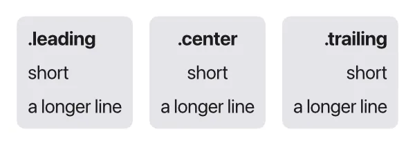
When you give a stack both spacing: and alignment:, spacing: comes
first: VStack(spacing: 4, alignment: .leading) { … }.
HStack(alignment: .top) { Icon(.star) Text(".top\nsecond line")}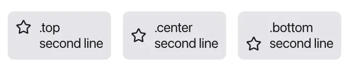
Pushing views to one end
Section titled “Pushing views to one end”Along a stack, children are packed together in the middle. To push them to
one end, fill the rest with a Spacer():
HStack { Spacer() Text("On the right")}VStack { Text("At the top") Spacer()}With spacers on both sides, a view sits in the middle of the free space between its neighbors, and the stack stretches across the whole width:
HStack { Button("Back") {} Spacer() Text("Title") Spacer() Button("Next") {}}Placing content in a frame
Section titled “Placing content in a frame”.frame(width:height:alignment:) gives a view a size, and alignment: says
where the view’s content sits inside it:
Text("topLeading") .frame(width: 140, height: 50, alignment: .topLeading) .background(.lightGray)Text("center") .frame(width: 140, height: 50) .background(.lightGray)Text, icons and SVG drawings are centered in their frame unless you give an
alignment. A stack with a frame is different: its children are spread over the
whole frame, and the stack’s own alignment: decides where they go. Giving the
frame an alignment too makes the stack keep its natural size and sit at that
spot in the frame instead.
Growing with maxWidth and maxHeight
Section titled “Growing with maxWidth and maxHeight”.frame(maxWidth:) makes a view take all the width it’s offered, up to the
maximum. Use .infinity for “as much as there is”. Together with alignment:,
this is the usual way to line views up with the edges of their container:
VStack(spacing: 10) { Text("Account").font(size: 20, weight: .bold) .frame(maxWidth: .infinity, alignment: .leading) Text("Signed in as sam@example.com") .frame(maxWidth: .infinity, alignment: .leading) Text("Last sync: today") .color(.secondary) .frame(maxWidth: .infinity, alignment: .trailing) Button("Sign out") {}.frame(maxWidth: .infinity)}.padding(16)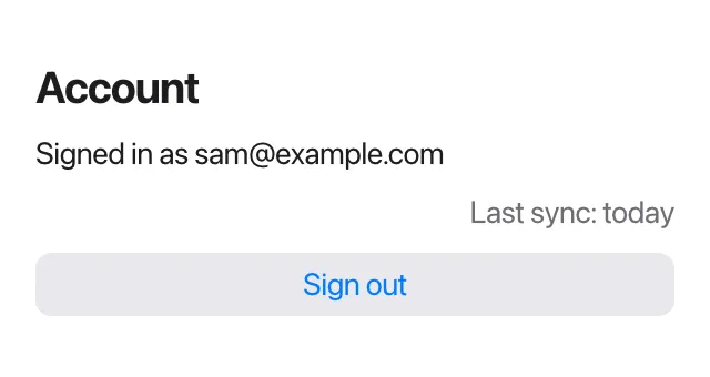
The button’s background stretches too, because the frame is the button’s own size.
.infinityis a shorthand for an infinitely largeFloat. It’s the only shorthand of its kind, and it’s meant formaxWidth:andmaxHeight:.- A finite maximum caps the growth:
.frame(maxWidth: 200)grows up to 200 points and no further. .frame(maxHeight: .infinity)does the same vertically, for example to let a view fill the rest of a window.- A view with a maximum is flexible, so a stack around it becomes flexible too.
Inside an HStack, a view with maxWidth: .infinity takes the room that’s
left after its fixed-size neighbors, like a Spacer would:
HStack { Text("Name").frame(maxWidth: .infinity, alignment: .leading) Text("Size")}Minimum sizes
Section titled “Minimum sizes”.frame(minWidth:) and .frame(minHeight:) keep a view from getting smaller
than a size. It still grows if its content needs more. A common use is
buttons of equal width:
HStack(spacing: 8) { Button("OK") {}.frame(minWidth: 100) Button("Cancel") {}.frame(minWidth: 100) Button("Don't save") {}.frame(minWidth: 100)}
Minimums and maximums combine, and alignment: works here as well:
Text("tall").frame(minWidth: 120, minHeight: 60, alignment: .bottomTrailing)Text("between 100 and 250").frame(minWidth: 100, maxWidth: 250)Layers with ZStack(alignment:)
Section titled “Layers with ZStack(alignment:)”A ZStack puts its children on top of each other, all centered by default.
alignment: takes any of the nine values and places every layer at that spot.
That’s how you put a badge in a corner:
ZStack(alignment: .topTrailing) { Icon(.bell).font(size: 32).padding(6) Text("3") .font(size: 11, weight: .bold) .color(.white) .padding(horizontal: 5, vertical: 1) .background(.red, radius: 8)}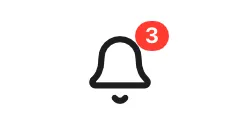
Lining up lines of text
Section titled “Lining up lines of text”Everything above moves whole views around. .textAlignment(…) is about the
lines inside a multi-line Text: whether they line up on the left, in the
center or on the right.
Text("Leading is\nthe default")Text("These lines\nare centered").textAlignment(.center)Text("And these go\nto the right").textAlignment(.trailing)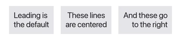
Only the left-to-right part of the alignment counts, so use .leading,
.center or .trailing.
Like .font, .textAlignment is inherited: set it on a stack, and every text
inside follows it.
VStack(alignment: .trailing) { Text("Inherited\nfrom the stack") Text("both lines\nright")}.textAlignment(.trailing).textAlignment doesn’t move the text’s box. Where the box goes is still up to
the stack’s alignment: or a frame’s. For a paragraph that wraps across the
full width, combine the two:
Text("A long paragraph that wraps onto several lines, centered in the window.") .textAlignment(.center) .frame(maxWidth: .infinity)